
Andy Warhol, The Witch, from Myths, 1981. Evening & Day Editions London.
We all wish we had it, but then again, maybe we do. Synesthesia, or the synthesis of senses, describes a phenomenon that only the especially perceptive experience — a kind of crossover between the senses. If you think about it, you’ve probably had such an experience. Hasn’t there ever been a time when a particular piece of music filled your inner eye with a color? Or when the texture of a physical sensation made you think of a particular taste?

Andy Warhol, Black Rhinoceros, from Endangered Species, 1983. Evening & Day Editions London.
Up above, Andy Warhol’s Black Rhinoceros from his Endangered Species series uses color play against a green background to evoke our sense of empathy. But would we be crazy to say this work also sounds like the unstable pang of a first-inversion D minor triad and tastes like the sharp sting of fresh mint, which — each in their own way — evoke a similar poignant response? (Don't answer).
Here, we unlock all the ways to perceive the color green in our upcoming Evening & Day Editions London Auction.
Green in the eye
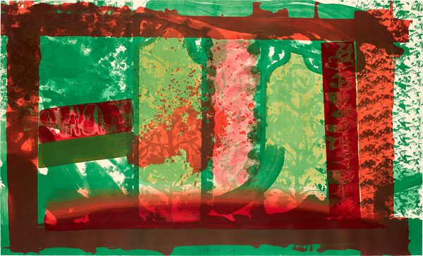
Howard Hodgkin, Bleeding, 1981–82. Evening & Day Editions London.
The human eye can perceive more variance in tone within green than any other color. It’s thought that this ability derives from evolutionary requirements to aid our skills in hunting, allowing us to glimpse animals more clearly in a dense forest. Clearly seen in the variety of green shades in this selection of works, our own advanced occuluar perception of the color is something that artists render to their advantage.
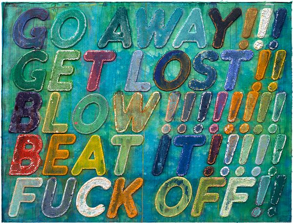
Mel Bochner, Go Away, 2013. Evening & Day Editions London.
In the eye, green also has clear semiotic meanings, often used in public signage to denote things that are allowed. Think traffic signs, stop lights, safety messages, recycling signs, etc. In a sense, green can mean “yes” or “go” or a host of positive things. This is part of the magic in Mel Bochner’s Go Away, which calls upon a green background for an image that defies our standard perception of the color’s meaning in signage, allowing such a strong message to make us smile. Even this summer’s latest color obsession — Brat Green — in many ways is a “go” sign for not caring what others think. This makes us think of the bratty green (but not Brat Green) raccoon in David Shrigley’s I’m Sorry I Can’t Promise It Won’t Happen Again. So Julia.
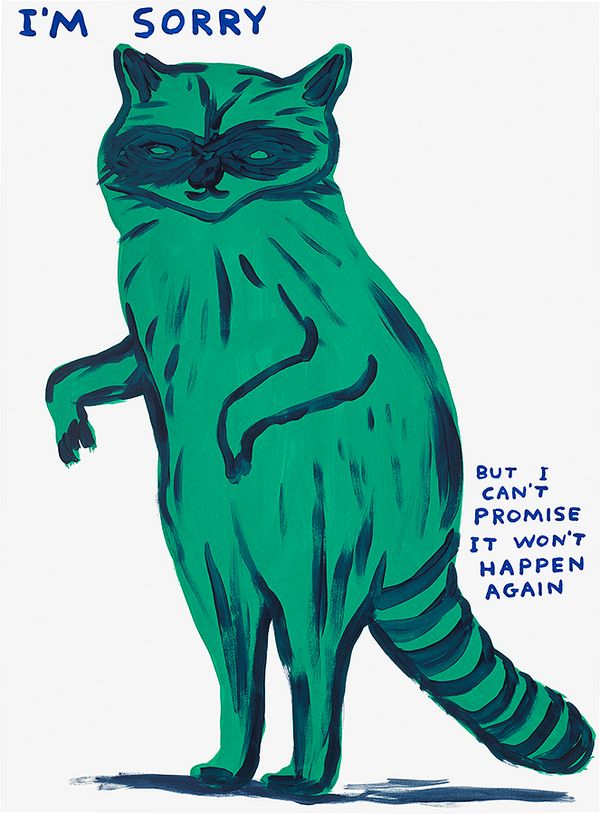
David Shrigley, I'm Sorry I Can't Promise It Won't Happen Again, 2021. Evening & Day Editions London.
Green pigments have had an interesting history — though a common color throughout art history, artists were required to mix their greens themselves until modern developments led to green pigments. One of the most notable was Scheele’s Green, developed in 1775 by Carl Wilhelm Scheele. Perhaps due to our eye’s natural affinity for the color, this pigment became a status symbol among the privileged classes, who often used it to decorate their interiors, and often to their detriment. The pigment was eventually discovered to be toxic and is even believed by many experts to have contributed to the death of Napoleon (it was the wallpaper that did it, so the thinking goes). But fear not; the prints in our sale are as non-toxic as Brat Summer.
Green to the ear
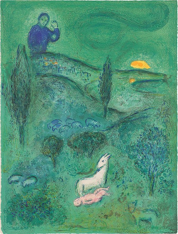
Marc Chagall, Découverte de Daphnis par Lamon (Lamon Discovers Daphnis), 1961. Evening & Day Editions London.
Chromesthesia is a subset of synesthesia that describes those who experience automatic and intense perceptions of color associated with certain musical sounds. Musicians ranging from Alexander Scriabin to Beyoncé have described this experience and its impact on their work. Though many synesthetes perceive things differently, there is a common understanding of which colors are associated with which pitches, and many people experience an overarching color for the moods associated with certain tonal centers (what musicians call “keys”) rather than a flurry of colors for each successive pitch.
But we all experience this to some extent. Have a listen to the first movement of Beethoven’s Pastoral Symphony in F major — the greenest of all keys — and then try to tell us those joyful harmonies don’t sound green. (Interestingly, F major is closely related to its relative minor, D, described so poetically by the fictional guitarist Nigel Tufnel in Spinal Tap as the “saddest of all keys” and frequently associated with the color red, the complimentary color to green and a tonal mix explored in many works throughout this article). Such sonic perceptions of green, as in the Beethoven Symphony, are often associated with nature and cheerful springlike feelings of renewal. We find a natural resonance between this idea and these works by Marc Chagall and Peter Doig.

Peter Doig, Alice at Boscoe's, 2023. Evening & Day Editions London.
Green on the nose
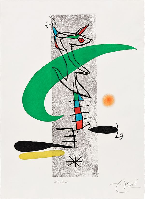
Joan Miró, La translunaire (The Translunar), 1974. Evening & Day Editions London.
Connoisseurs of fine perfumery will know that a “green” is a type of fragrance that rose in popularity at the end of World War II, perhaps due to a shared cultural sense of renewal. These fragrances utilize vegetal and natural notes, such as mosses, green tea, or leaves, to create a fresh sensation that anyone would easily say “smells green.” To our eyes and noses, Joan Miró’s La translunaire conjures the dynamic play of scent molecules in the atmosphere, summoning green olfactory notes and leaving a scent in our memory that is as lasting as the image. By extension, the witch from Warhol’s Myths is most certainly wearing a green fragrance, and a strong one at that, heavy on the oak moss and violet leaf. You can smell it from here.
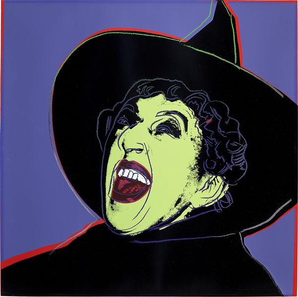
Andy Warhol, The Witch, from Myths, 1981. Evening & Day Editions London.
Green on the palate
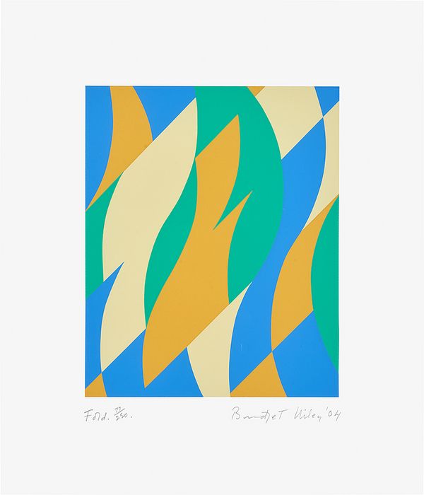
Bridget Riley, Fold, 2004. Evening & Day Editions London.
Flavor associations with green abound as well. Brigit Riley’s delicious Fold overflows with mesmerizing shapes that remind us of light filtering through a tasty green liquid in a crystal glass. In this and Oriflamme by Sonia Delaunay, the forms seem to converge like hard candy flavors melting in your mouth. For us, the Riley is a sweeter green with a delightful hint of aspartame and the Delaunay, herbal in a licorice sense.
Just think of how many artificially flavored candies and soft drinks you’ve had that you could only describe as tasting green. Natural green flavors exist as well, such as in the Matcha from Sayuri Tea, which sponsored this season’s etching workshop, inviting visitors to enjoy an extra-sensory experience in the Phillips gallery.
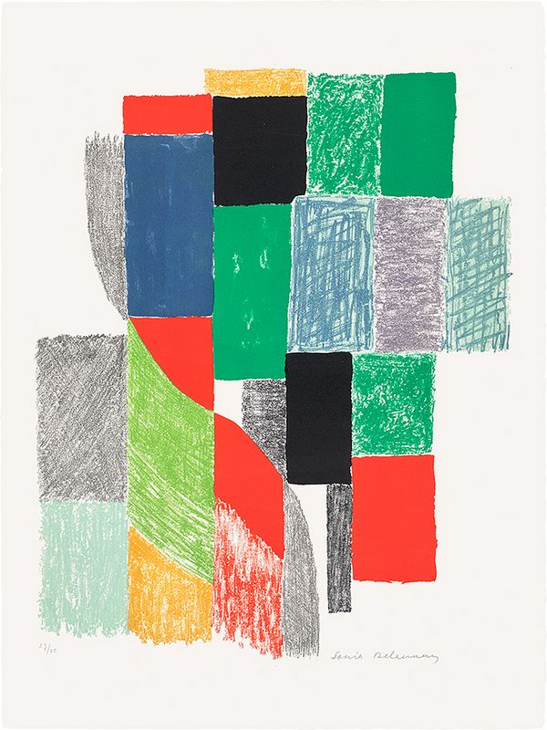
Sonia Delaunay, Oriflamme (Flame Banner), 1968. Evening & Day Editions London.
Green to the touch
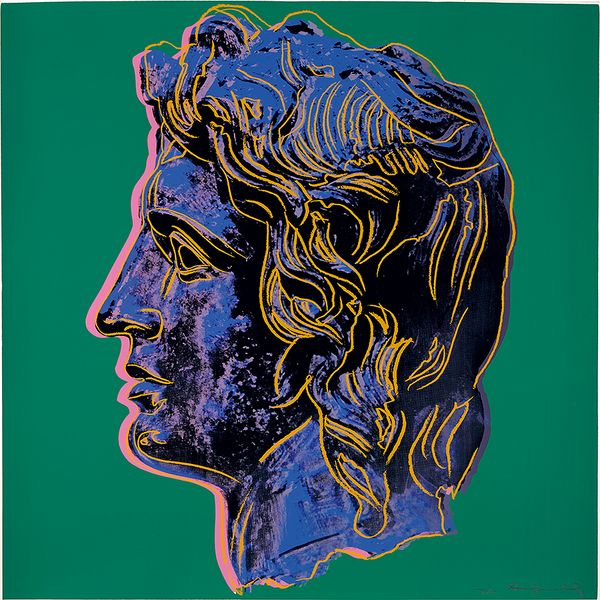
Andy Warhol, Alexander the Great, 1982. Evening & Day Editions London.
For tactile-visual synesthetes, there is no universal sensation associated with the color green, rather they all perceive it differently. Often, when touching a smooth leafy texture, they can feel their being radiate with the color, and by contrast, certain colors induce physical sensation. Here, we find that Andy Warhol’s Alexander the Great evokes the tangible sensation of copper or bronze patina in our fingers, appearing relief-like in its texture and recalling associations between green and the texture of aged metals.
Green in meaning
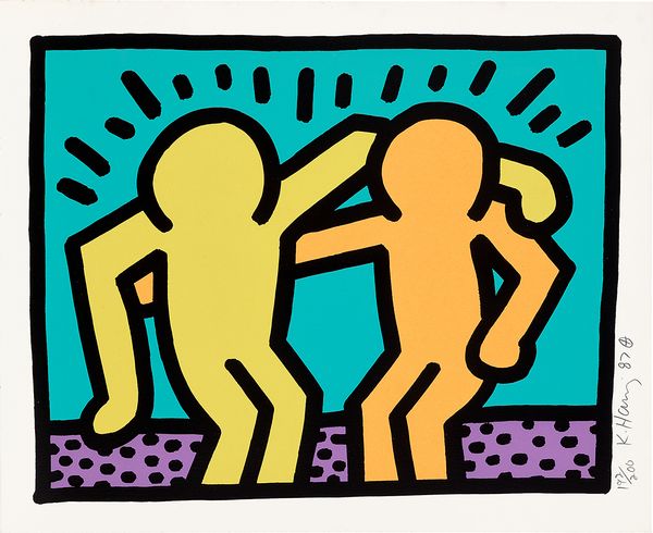
Keith Haring, Pop Shop I: one plate, 1987. Evening & Day Editions London.
One of the unexpected extra-sensory perceptions associated with the color green is the actual ideas the color conveys. Often subconscious reactions for both synesthetes and the rest of us, the color has long been associated with health, wellness, and friendliness. We find no better expression of this idea than Keith Haring’s Pop Shop I.
Recommended Reading
Specialist Picks: How Much is That Rhinoceros in the Window? >