
Kenneth Tyler pulling an impression of David Hockney’s Potted Daffodils, 1980
Wonderfully impartial and utterly adaptable, gray has a mysterious ability to seamlessly fit, unobtrusive and uncomplicated. Printmakers have long worked in grayscale, and there is perhaps no medium better suited for gray: black ink and white paper, these are the fundamental building blocks of printmaking. Gray is a hue of great plasticity, with an infinite zone of differentiated values from warm to cool, light to dark. Looking at the work of Picasso, Ruscha, Johns and Hockney, we see four artists approach the suppleness of grays, all through the medium of lithography.
Pablo Picasso
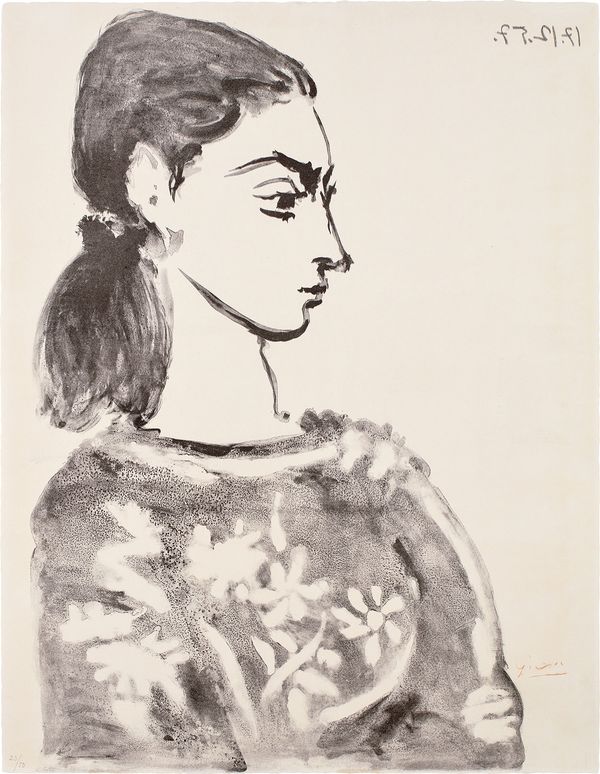
Pablo Picasso Femme au corsage à fleurs (Woman with Flower Bodice) (Jacqueline Roque), 1957
Pablo Picasso’s prints, up until about 1945, can be categorized by their linear nature. Previously favoring etching amongst the various printmaking techniques, by the late 1950s, with the guidance and collaboration of lithographer Fernand Mourlot in Paris, Picasso quickly acquired a mastery of the traditional tools and techniques of lithography. The artist's work quickly attained a painterly quality in his lithographs through his gestural use of crayon and brush.
In 1955 Picasso began making portraits of Jacqueline Roque, they would later be married in 1961, and her image would come to dominate his work. Often presented in profile, the viewer is scarcely met by Jacqueline’s gaze in these lithographs, though linocuts from the next few years show her head-on. Instead, there is sensitivity and tenderness towards the handling of her form, an unobtrusive quietness in her depiction. Printed from a brush drawing on a zinc plate, subtlety and lightness in the delicate dark gray washes are retained through Picasso’s use and manipulation of surface, creating a work that flows, from the flowers on her bodice to the swift line of her jaw.
Ed Ruscha
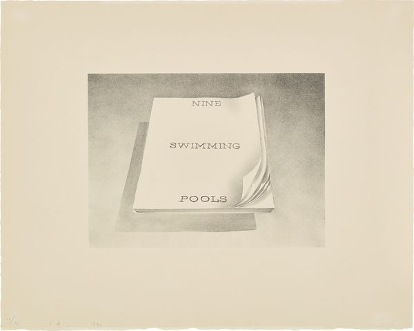
Ed Ruscha Nine Swimming Pools, from the Book Covers series, 1970
Based on the imagery and subject matter of his artist’s books of the same title, Nine Swimming Pools and Various Small Fires, are two finely hand-drawn lithographs. Published by the experimental, and research-based Graphicstudio at the University of South Florida in small editions of 30, Ruscha’s Book Covers series is difficult to distinguish from his graphite drawings. To achieve their smoky and atmospheric quality, Ruscha carefully worked back into the drawing on stone with a sharp lithographic pencil in order to define detail; the delicate bending of the first few pages of Nine Swimming Pools.
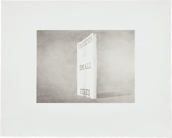
Ed Ruscha Various Small Fires, from the Book Covers series, 1970
The first few pages of Nine Swimming Pools are gently bent back as if caught in a light breeze, a heavenly floating book depicting the way Ruscha felt about these works. “If there is any facet of my work that I feel was kissed by angels, I’d say it was my books,” the artist recounted. Both Nine Swimming Pools and Various Small Fires demonstrate the artist’s interest in commercial art and typography: “I like the idea of a word becoming a picture, almost leaving its body, then coming back and becoming a word again.”
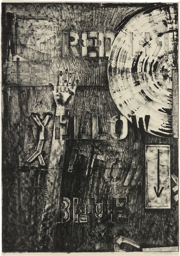
Jasper Johns
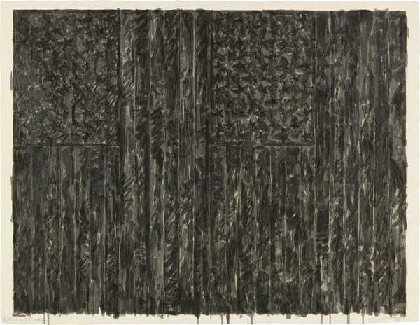
Jasper Johns Flags II, 1973
A density of surface characterizes the screenprint Flags II, 1973, such that the print takes on an entirely new quality. Thirty-three screens were used and printed in transparent graphite inks. It is neither a painting, drawing, nor relief sculpture, but a bit of all three. By adding varnish to some of the printing inks—notably on the right side—and using cut stencils in concert with more painterly resist stencils, Johns was able to make a surface that emulates encaustic on one side, oil paint on the other.
Jasper Johns Land's End, 1979
The planar surface of Land's End reveals itself through a complex overlapping of forms. Rife with motifs used by Johns throughout his work, such as an arm, an arrow, a target and stenciled letters, all are defined by tones of gray. Gray tends to connote ambiguity, but in Land’s End, gray defines surface, uncomplicated by additions of color. Created using a solid lithographic crayon and a single plate, Johns pushed the tonality of this print to its limits. The surface of the plate had to be inked with great precision in order to capture the slight variations in tone that Johns was after. “… a long project,” said Gemini master printer, Charly Ritt, “there was something very subtle next to something very dark and you had to get that dark, dark and rich, and you had to keep that subtlety and openness of something that was light.”
David Hockney
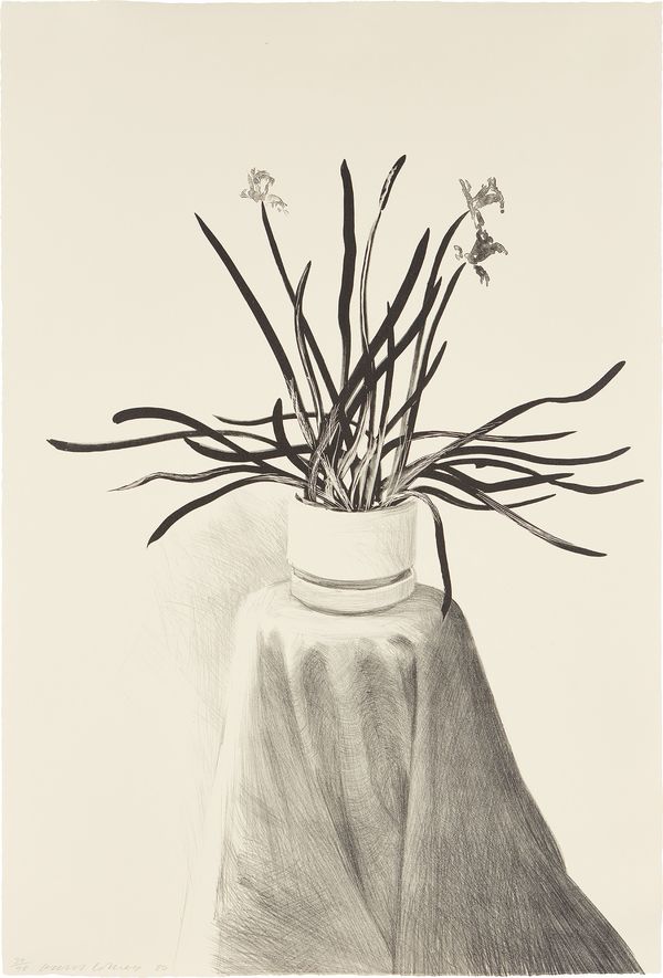
David Hockney Potted Daffodils, 1980
David Hockney is an infinitely versatile artist, having experimented with painting, photography, drawing and sculpture. Printmaking, however, has been a constant feature of Hockney’s work, having first studied lithography as a teenager at the Bradford College of Art.
Tyler Graphics promise as an experimental and collaborative printshop allowed Hockney to try new things, especially useful to the artist during times of stylistic impasse. A skilled draftsman, David Hockney’s Potted Daffodils and Black Tulips, focused on refining his precise and technical skills in lithography. Kenneth Tyler, master printer and founder of Tyler Graphics wrote of Hockney and his approach to printmaking, “The artist plays an important role in this evolution [of techniques], since it’s his or her imagery that the printers are experimenting with. In David’s case, as one of the most process minded artists to collaborate in a workshop, he would get turned on by a particular step in the printmaking and then try to adapt or alter his drawing so both artist and printer has success. Keeping all avenues open for constant experimentation is what I call the ‘building block’ approach. Each step as represented as a ‘building block’ adds up eventually to some breakthrough.”
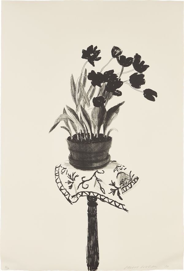
David Hockney Black Tulips, 1980
Mesmerizing in their monochromatic simplicity, Potted Daffodils and Black Tulips differ markedly from Hockney’s more colorful and often flat Californian landscapes. These prints exemplify the artist’s mastery of lithography and represent an interest in still life, as well as light, shade and form.