
Helen Frankenthaler, Gateway, 1988. Editions & Works on Paper.
Phillips' 19-21 October Editions & Works on Paper auction features works from the 1950s through today, and just as the images reflect each decade, they also showcase advances in the printmaking processes used to create them. Here, we explore those developments by imagining how writers of each era might interpret the works in their own creative catalog entry.
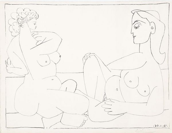
Pablo Picasso, Deux femmes sur la plage, 1956. Editions & Works on Paper.
Guest Cataloger: Gertrude Stein
Between 1945 and 1969, Pablo Picasso produced over 400 lithographs at the Mourlot Studios in Paris, where the artist would often spend months at a time in Fernand Mourlot’s atelier interpreting and advancing the medium. The lithograph process itself mirrors Picasso’s own relentless explorations of shape, movement, and reproduction. Deux femmes sur la plage is a work from 1956 that combines the artist’s approach with lithography's own development as a fine art; a meditation on a printing process: two relaxing forms, in simple black and white, rest peacefully against the backdrop of Picasso’s voracious work rate. And who better to catalog the work than longtime champion, collaborator, and lover of repetition Gertrude Stein? Although she had passed the previous decade, was there any other choice?
Catalog Entry: Lithograph! The very word does the Greek world bring to us: to write in stone, rather now to sit on the stone beaches of France, this pair of feminine forms there, there, there in poetic movement, in meter. On the left, stress, on the right, unstress, the former curled to the latter’s opening. And of a count of fifty, no less — we flip through the pages of sameness and feel the rhythmic pattern of its maker, over and over and over and over: Pa-blo, Pa-blo, Pa-blo, Pa-blo, Pa-blo, Pa-blo!
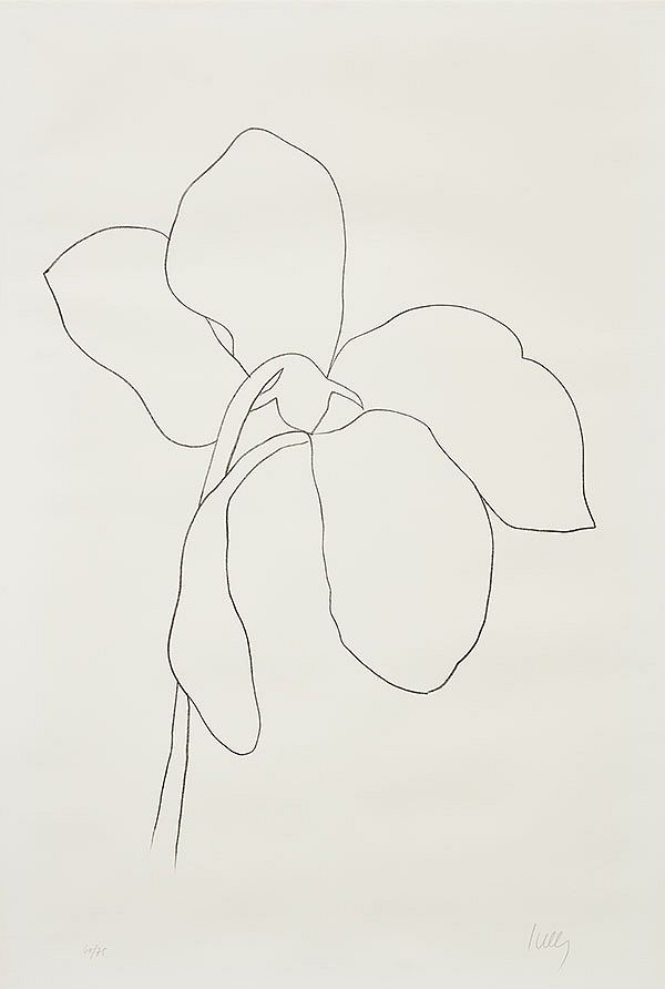
Ellsworth Kelly, Cyclamen III, 1964-5. Editions & Works on Paper.
Guest Cataloger: Joan Didion
In 1964, Ellsworth Kelly began work on two simultaneous projects: Suite of Twenty-Seven Color Lithographs (1964-65) and Suite of Plant Lithographs (1964-66), both printed and published in Paris by Aimé Maeght, the founder of Galerie Maeght. Cyclamen III invokes the Impressionist and Modernist inspirations of Jean Arp and Henri Matisse, and showcases the unadorned, yet striking form of the flower. Kelly would often forego drafts and instead draw directly onto transfer paper before printing from zinc plates, showing a commitment to natural shape and the relationship between the hand and eye that defined his style. Across the Atlantic, the young Joan Didion was herself exploring the contours of culture in a world that was growing narratively complex and missing the crucial element of enjoyment.
Catalog Entry: It was a symptom of the ‘60s that each year contained within it the kernels of the following three or four, however, they were only visible in hindsight and understandable in memory. And so was such an unready categorization for Mr. Kelly. One of effect instead of affect, best recognized in Suite of Plant Lithographs, and particularly in Cyclamen III. We look for the sermon in the flower, for the social or moral lesson in the wilted shape. We interpret what we see, select the most workable of the multiple choices. We live entirely, especially if we are artists, by the imposition of a narrative line upon disparate images, by the “ideas” with which we have learned to freeze the shifting phantasmagoria which is our actual experience. Or at least we do for a while, until Cyclamen III listens to these narratives, absorbs them all, and gives us back not something bleak, or profound, or thoroughgoing, but something lilting, instinctive, that we can enjoy it, easily if we let it in, without having to imagine ulterior motives for it all.
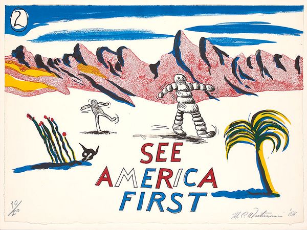
H.C. Westermann, See America First Portfolio, 1968. Editions & Works on Paper.
Guest Cataloger: Hunter S. Thompson
H.C. Westermann took the advice of the ubiquitous travel brochures and ad campaigns of the time and set out to explore the country low and slow. The resulting project, 1968’s See America First Portfolio, cast Westermann’s wry observations throughout the United States into a series of 17 color lithographs that depict the preservationist lean of the artist with trademark humor and expansive imagination, as well as showcasing a keen sense of craftsmanship indeed and a look at an early DIY approach that would grow into wider culture in the coming years. The work was printed at Tamarind Lithography workshop in Los Angeles, the historic post-war printshop powerhouse, marking the 60s as a new era of portfolio and multiples making. The set in our auction is being offered by the Museum of Modern Art, where Westermann's work has been held and exhibited. Perhaps somewhere along the long roads he traveled, well into the deserts of the Southwest, we can imagine Westermann getting a quick high-beam warning from Hunter S. Thompson ahead of a speed trap.
Catalog Entry: By '68 much of the day-glow refuseniks were getting into a radical new thing called equity from home ownership. All that worry about when and where the bomb would drop faded away, internalized two decades prior between their clasped fingers under their desks at school, projected through a cloud of smoke driving up the Pacific Coast Highway for some fun in the Bay and forgotten on the way back down to scout a rental condo in San Diego. Gizmos were getting smaller, gadgets too — you didn’t need one of those industrial printers anymore; they had these hand-fed lithograph presses you could feed the thing through manually and send it through the cylinder cycle like Donald Duck flattening and expanding along the gears of a machine. Old Westermann knew exactly what he was doing with it. The image is twice reversed and comes out the same way around as it did going in, just like the rest of us, detour after detour and back where we started, a little more enlightened but with the same crooked smile.
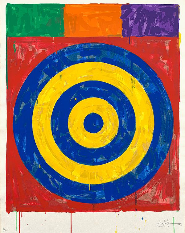
Jasper Johns, Target, 1974. Editions & Works on Paper.
Guest Cataloger: John Updike
Spontaneity is a lot more labor-intensive than one might think. To achieve the layered saturation of 1974’s Target, Jasper Johns drew, proofed, and subsequently discarded several iterations. The print was an early collaboration in what would become a longstanding working relationship with a group of Japanese master printers at the Simca Print Artists workshop in New York. During this process Johns ran off a two-screen Target in gray and black as a release from the problems of the color version. The final version is a print from twenty-seven screens on J.B. Green paper that exhibits Johns’ hallmark depth of color and painterly texture. The pains of mastering a simple objective though continuous trial, error, and attention to detail could be no better described by a master of revisit and redo, John Updike.
Catalog Entry: The studio was a high-ceilinged industrial room whose instruments were painted the shade of green commercially called moss. A summer noon probed through the open windows. Years ago, when the shade was called army, the printers made an intolerable noise. Today, they’re well-maintained to the level of quartz reliability. Jasper is seated in the far corner with the pallor of a sheet. Something's off. Later, years later, he could look back at this as the moment he found a reserve of some sort, the typically American kind that inspires all retrospectives, with stories of brilliance striking here, just when all felt wrong, but in real time, Target moves farther away with each crack at it. At the center sits a blue iris, a bit darker than his own, but his nonethless, inhereted from his hand rather than his genes, but it was his, without a doubt. It was his and he was going to figure it out.
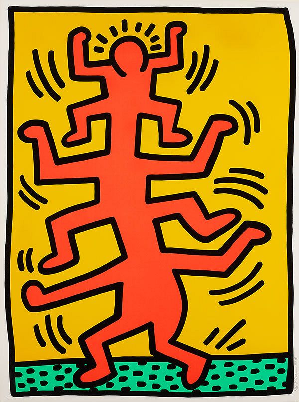
Keith Haring, Growing, 1988. Editions & Works on Paper.
Guest Cataloger: Margaret Atwood
Keith Haring began making screenprints in 1983, and by 1988 was producing work that showed his natural skill with the medium and commercial perfection of the process. Created while he was still in his 20s, Haring’s Growing series is a trademark depiction of the artist’s vibrant use of color, energy, and motion with themes of togetherness and community. The series is also doubly reflective of the era in which it made: the subject itself proliferates, like the connections that were growing between people and the world around them, creating a juxtaposition of feeling: of alienation in a crowd, of celebrating life against the backdrop of dystopia. Such a feeling encapsulates the approach set out by Margaret Atwood, whose writing finds a complement of darkness and light with Haring.
Catalog Entry: It was a common image here and throughout the world in the ten-year night that was the 1980s. The divided self, having done its job of being who it needs to be during work hours, must in turn molt its skin as part of a daily habit of self-preservation and rest. It was a process of flattening for most, but for Haring, it was an act of generation. It was a rejection of this great flattening with such force that it could be contained by the rules-bound system, which in turn ostracized it by force. In us, for better or worse, are multitudes, and the first of us to discover it were the first to face the great flattener. How did Haring learn it, that talent for insatiability? It was in the air; and it was still in the air, an afterthought, as he tried to create, in the city that had been set up to crush him, with art that screamed because it could not talk.
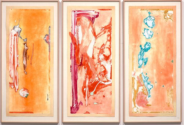
Helen Frankenthaler, Gateway, 1988. Editions & Works on Paper.
Guest Cataloger: Fran Lebowitz
Pushing aesthetic boundaries was not enough for Helen Frankenthaler — her work was a catalyst in the evolution of Abstract Expressionism into Color Field painting, but it’s the technical advancements made in the realization of 1988’s Gateway that set new horizons for printmaking towards the end of the century, and further still today. The mixed media piece, created with Ken Tyler at Tyler Graphics, in Mt. Kisco, New York, was part of a five-year endeavor that saw Frankenthaler engage in what can only be described as alchemy: using large magnesium and copper plates along with stencils, molten wax, foundry casting, paint, lacquer, steel wool, metallurgy and chemical processing (and the list continues), Frankenthaler created a multi-disciplinary, multi-dimensional work that endures as an emblem of both her transcendent style and indeed how far the art of printmaking had come. A consumate work by a New Yorker that took years to finish, you say? Well then, the entry can only be done by a consumnate New Yorker with an indisposition for deadlines, the one and only Fran Lebowitz.
Catalog Entry: Helen Frankenthaler is a New York institution, but you know that. Tyler Graphics is a New York institution, but you know that, too. Then there’s this thing called scale, which is something like six entries down the definition line, although it should be first, because the idea of relative size or distance has much more to do with life than with fish. Looking at the list of materials used in Gateway could also double as a list of things I’ve never touched and have no intention of touching, but the scale of it, the sheer endeavor of the piece reminds me of the boundless capacity for surprise in this city. What can you compare it to? It is the city. It’s sprawling, elusive, absurd, all of it. Colorful, layered, heavy, unconventional. It’s packed to the gills — goodness me, there’s that fish I lost — with meaning and feeling, but it won’t open up to you unless you invite it in. Then it’ll talk your head off.
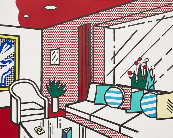
Roy Lichtenstein, The Living Room, fom Interior Series, 1990. Editions & Works on Paper.
Guest Cataloger: Bret Easton Ellis
Inspired by furniture ads in phone books and magazines, Roy Lichtenstein’s Interior Series depicts a set of domestic spaces that typify the artist’s blurring of art and design. The image in Living Room makes use of his signature flat style with depth given by Ben-Day dots. The work combines familiar objects with bold colors and a sense of dimension along the focal line towards the end of the room where the two walls meet. Over the course of his decades-long relationship with the Gemini G.E.L. Workshop in Los Angeles, Lichtenstein turned to the Melrose Avenue printers and publisher for his large, serialized works, with the Interior Series as a perfect example of how the image takes on presence with the use of augmented scaling. Living Room, with its immaculate arrangement, clean lines, and ominous woodcut and screenprint layering, wouldn’t look out of place on the 11th floor of the American Gardens building at 55 West 81st Street, New York, where an infamous Bret Easton Ellis character liked to unwind, among other things.
Catalog Entry: It is an open, welcoming space with no one there to greet me, removing all pretense of the latter. The couch is a Lichtenstein, a custom job like the table and couch, and likewise all from catalogs that don’t include prices, only call numbers for quotes. It is a midcentury landscape that comes in and out of style every few years, now very much in with the other VPs at D&L who saw the couch at my place after a night of drinks, then it was at Jeff Haller’s apartment the week after, then Larry Reade’s after that. I have the only set of striped throw pillows. I also have the only table with tempered glass. On the wall is a print, a numbered edition, purchased in at auction. Signed and numbered 15 of 60 by the artist. Printed by Gemini G.E.L., logo included. Haller and Reade have reproductions.
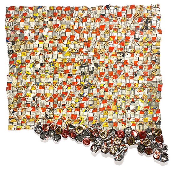
El Anatsui, Paper & Gold, 2017. Editions & Works on Paper.
Guest Cataloger: Zadie Smith
El Anatsui’s assemblages often blur the line between textiles and sculptures, and his use of found objects highlights the artist’s themes of consumption and environmental harm. The deliberate lack of form and malleability of his pieces finds a natural companion in print, with Paper & Gold colored by inkjet pigment and featuring irregular edges around the woven paper, along with hand-cut and sculpted aluminum collage that give the piece movement. Compared to photomechanical prints, Paper & Gold is an example of digital ubiqity in contemporary printmaking, wherein rather than through traditional plates, the entire process is computer-controlled. El Anatsui's world is filled with stuff, the byproduct of a culture of accumulation and conspicous consumption gone global. A bottlecap or cartridge may have been thrown away by one of Zadie Smith's characters in London, thousands of miles from the artist's studio in Nigeria.
Catalog Entry: Printer ink, we’re told, is among the most expensive, if not the most expensive liquid in the world. Rather than buying a new cartridge, the cost of purchasing an entirely new unit (with complimentary ink) is often cheaper than getting the ink alone. The result of such a palaver is a twofold farce: a printer becomes the ornament around the thing one actually needs, and the rest is mechanical rubbish to be binned and sent along with the rest of the refuse we don’t think about to the places on the map we don’t think about. Then the people we don’t think about come up with ingenious ways to reuse the material and from the throwaway end of the consumer cycle, we are given art. In Paper & Gold, El Anatsui binds together the global supply chain with copper wire and reminds us that all things have purpose, even after the end user agreement.
Recommended Reading