A totem, or doodem, is a spirit being, a sacred object that serves as an emblem of people. Borne of the North American Ojibwe culture, who believe in tutelary spirits and deities, the term has evolved and been incorporated into various cultures worldwide to represent a personal identification with a spirit guide. Doodem directly translated means ‘to do with one’s heart’ and is connected to a clan or ancestry, linking the living to the dead, and the past to the present.
For Keith Haring, who had been drawn to the imagery of ancient and primitive cultures throughout his career, the symbolic spiritualism of a totemic object made it the perfect form for his own idiosyncratic visual lexicon of signs and symbols. Made the same year as the artist was diagnosed with AIDS, the sarcophagus shape recognises man’s mortality but hints at an embalmed, immortal afterlife. Within the confines of the concrete sarcophagus outlines, Haring’s energetic and busy figures are pushing the boundaries in which they’ve been encased. Jumping and reaching toward the sun, the two figures at the top of Totem are living, striving for that which we all chase. Reflective of Haring’s own history, challenging societal norms, Totem captures the vitality of life but reminds us of its impermanence.
'The drawings I do have very little to do with classical, post-renaissance drawings, where you try to imitate life or make it appear to be life-like. My drawings don’t try to imitate life; they try to create life, to invent life. That’s a much more so-called primitive idea, which is the reason that my drawings look like they could be Aztec or Egyptian or Aboriginal… and why they have so much in common with them. It has the same attitude towards drawing: inventing images. You’re sort of depicting life, but you’re not trying to make it life-like. I don’t use colours to try to look life-like, and I don’t use lines to try look life-like. It’s also much more Pop, I guess, after growing up in a really carbon-and comic-dominated period. And, also, growing up with Pop art.'
—Keith Haring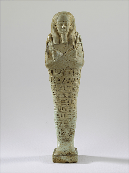
Shabti of Neferibre-saneith, 6th century B.C., Szepmueveszeti Muzeum, Budapest. Image: The Museum of Fine Arts, Budapest/Scala, Florence Provenance
Schellmann Art, Munich
Literature
Jörg Schellmann, ed., Forty Are Better Than One, Munich/New York, 2009, pp. 144-145
Artist Biography
Keith Haring
American • 1958 - 1990
Haring's art and life typified youthful exuberance and fearlessness. While seemingly playful and transparent, Haring dealt with weighty subjects such as death, sex and war, enabling subtle and multiple interpretations.
Throughout his tragically brief career, Haring refined a visual language of symbols, which he called icons, the origins of which began with his trademark linear style scrawled in white chalk on the black unused advertising spaces in subway stations. Haring developed and disseminated these icons far and wide, in his vibrant and dynamic style, from public murals and paintings to t-shirts and Swatch watches. His art bridged high and low, erasing the distinctions between rarefied art, political activism and popular culture.
Property of an Important German Collector
35
Totem (Concrete)
1989
Cast concrete wall relief.
179.5 x 54.5 x 5 cm (70 5/8 x 21 1/2 x 1 7/8 in.)
Signed and dated in black felt-tip pen on the accompanying metal plaque, a proof aside the edition of 25 (there were also 5 in Roman numerals and 7 artist's proofs), published by Edition Schellmann, Munich and New York.
Estimate
£60,000 - 80,000 ‡
Sold for £138,600
Rebecca Tooby-Desmond
Specialist, Head of Sale, Editions
T +44 207 318 4079
M +44 7502 417366
rtooby-desmond@phillips.com
Robert Kennan
Head of Editions, Europe
T +44 207 318 4075
M +44 7824 994 784
rkennan@phillips.com
Anne Schneider-Wilson
Senior International Specialist, Editions
T +44 207 318 4042
M +44 7760 864 748
aschneider-wilson@phillips.com
Evening & Day Editions
London Auction 14-15 June 2022
177
This lot is no longer available.
178
This lot is no longer available.
206
This lot is no longer available.