“The idea that what an artist does is mark the world so that you can see it again (in addition to making a mark that is intrinsically interesting to look at) is, I think, the defining principle of Ryman’s work.”
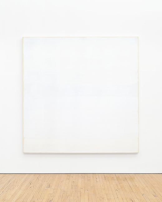
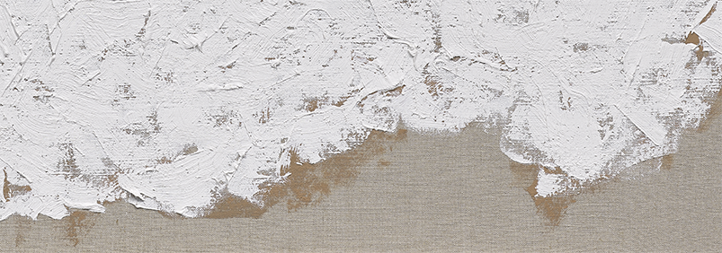
—Robert StorrRobert Ryman’s signature minimalism belies a richness of texture in Mark, 2002. The support is a medium-weight linen with a cool, natural flax tone that contrasts the warmer, sand-colored underpainting of Mark. Over this base, Ryman fills the picture plane, almost to the corners, with thick, white oil paint, applied with short, curving marks. This treatment of paint adds texture to the otherwise monochrome surface, as light catches the peaks of paint and casts shadows on the valleys.
The linen base of Mark is stretched in a perfect square, 40 x 40 in. (just over one meter square), but the composition itself is not-quite-square. Instead, the artist has chosen, as indicated by the boundaries of the sand-colored underpainting, to apply paint in a trapezoidal shape, that comes almost, but not quite, to the edges of the picture plane; the white paint draws tangent to the sides of the stretcher, but curls away at the corners, like seafoam receding on a beach. This artistic choice emphasizes the fact that this painted surface is exactly that—a surface—an illusion, crafted in oil paint, and placed on the wall before us.
Born in Tennessee in 1930, Ryman trained as a jazz musician before transitioning to the visual arts in his early 20s, when he moved to New York City. He describes the shift as the result of natural curiosity: one day, he went to the art supply store, purchased oils, canvas, and brushes, and began to experiment. “I was just seeing how the paint worked,” he said.i This self-motivated experimentation guided Ryman’s practice for the rest of his life.
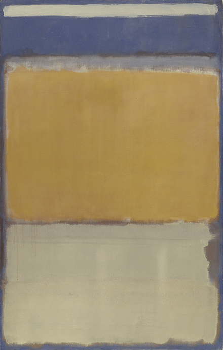
Mark Rothko, No. 10, 1950. The Museum of Modern Art, New York. Image: © The Museum of Modern Art/Licensed by SCALA / Art Resource, NY, Artwork: © 1998 Kate Rothko Prizel & Christopher Rothko / Artists Rights Society (ARS), New York He soon took a job as a gallery guard at the Museum of Modern Art, where he worked from 1953-1960, and each shift, he closely observed masters of the medium, from Henrí Matisse to Mark Rothko.ii The first Rothko that Ryman saw, No. 10, 1950, was accessioned to MoMA’s collection during his first year as a gallery guard.iii Ryman recalled the effect that Rothko’s work had on him, years later, and how he found Rothko’s “radical” approach inspirational: “…there was no reference to any representational influence. There was color, there was form, there was structure, the surface, the light—the nakedness of it, just there. There weren’t any paintings like that.”iv
Ryman’s description of Rothko could easily be a description of his own painting practice—the primacy of color, form, surface, structure, and light certainly carries weight in Ryman’s work—but to view Ryman as merely imitating Rothko would be missing the point altogether. While inspired by other artists, surely, Ryman’s greatest inspiration has always been the painting process itself.
“I am not a picture painter, I work with real light and space, and since real light is an important aspect of the paintings, it always presents some problems.”
—Robert RymanIn a 1971 interview with Artforum, whenever Phyllis Tuchman pressed Ryman for his inspiration—at one point, she directly asked if his Delta series was inspired by Rothko—the artist always deferred to the process, whether that’s the type of support, or width of brush, or thickness of white paint. There’s no symbolism in his use of white, Ryman explained, only simplicity. He prefers white paint precisely because it allows him to focus on color; meaning, the color produced when white paint is applied over various supports (in the case of Mark, white over linen). “The white just happened because it’s a paint and it doesn’t interfere,” he told Tuchman. “It’s a challenge for me to use paint and make something happen with it, without having to be involved in reds, greens, and everything which would confuse things.”v
Ryman does not want color to distract from the task at hand, and so, his works are white. By the same token, the square format is “the most perfect space,” as it allows him to “put paint on it and do something with it,” without worrying over composition. Put simply: “The process is actually making the painting, that’s all.” vi
Untitled (Delta), c. 1965-1966. Dia Art Foundation, Beacon, New York. Image: Bill Jacobson Studio, New York, courtesy The Greenwich Collection, Ltd./Dia Art Foundation, New York, Artwork: 2023 © Robert Ryman / Artists Rights Society (ARS), New York Just like the first time he picked up a paintbrush, Ryman plays with “how the paint worked” in Mark. His simplicity of means keeps his work fresh across the decades, as he finds infinite variation within a set of rules; it is like poetry that follows a strict meter, or “jazz with a structure,” the artist’s favorite form.vii There is creativity in concision.
The same year as Mark, Ryman embarked on a new series, the Philadelphia Prototype, Philadelphia Academy of Fine Arts, in which he used paint to affix vinyl squares to a wall.viii This work anticipated a shift in Ryman’s practice, c. 2003-2005, where he switched from using white paint as a medium or tool (as in Mark and Philadelphia Prototype), to white paint as his subject matter.ix Subsequent works from the early 2000s reflect this change in mindset, and feature white paint over a dark ground; as a result, Mark stands as a late permutation of Ryman’s mature practice before this next creative jump.
“Intuitive at its source, Ryman’s work respects one strict rule: what is present is what matters…”
—Robert StorrMark, then, in all its subtlety, is an excellent example of Ryman’s signature process, which Robert Storr describes as almost mathematical in nature. Ryman selects four core elements—white paint, square format, brushstroke, support—and combines them “repeatedly and pragmatically,” in an “endless, non-redundant” manner.x As is true across his oeuvre, Mark holds the constants of white paint, and square format at its center. And so, the variations—the way in which Ryman makes marks on the painted surface; how the white square peels away from the edges of the linen; how he reveals the underpainting—capture the viewer’s attention.
In the catalogue essay for Ryman’s 2002 exhibition, New Paintings, PaceWildenstein, New York, which featured Mark, art historian Yve-Alain Bois writes on Ryman’s visible underpainting as further proof of his painterly inventiveness. Art historically, underpainting is seen as a relatively conservative technique, jettisoned early on by the Impressionists, and typically, it is not meant to be seen. By calling attention to underpainting, Bois writes, Ryman invokes the historical use of underpainting to imbue a painted scene with luminosity that shines from beneath the surface: white paint, for light; brown, for shadow; the color of blood rushing through a figure, bringing it to life. The illusion of reality in painting is shattered, and has been for more than a century, but works like Mark remind us of painting’s past, and the tension between that and its present.xi
i Robert Ryman, quoted in Robert Storr, Robert Ryman, exh. cat., Tate Gallery London; The Museum of Modern Art, New York, 1993, p. 12.
ii Ibid., 12-13.
iii Ibid.
iv Ryman [1986], quoted in Ibid., 13-14.
v Ryman, quoted in Phyllis Tuchman, “An Interview with Robert Ryman,” Artforum, May 1971, online.
vi Ibid.
vii Ryman, quoted in Storr, 12.
viii “Robert Ryman: Philadelphia Prototype,” Philadelphia Academy of Fine Arts, accessed Mar. 2023, online.
ix Jo Applin, “Same Old: Robert Ryman’s Repetitions,” in Stephen Hoban and Courtney J. Martin, eds., Robert Ryman, exh. cat., Dia:Chelsea, New York, 2017, p. 311-320.
x Storr, 10.
xi Yve-Alain Bois, “The Undertow,” in Robert Ryman: New Paintings, exh. cat., PaceWildenstein, New York, 2002, p. 8.
來源
紐約佩斯畫廊
私人收藏
紐約卓納畫廊
現藏者於2017年購自上述來源過往展覽
New York, PaceWildenstein, Robert Ryman: New Paintings, October 11–November 9, 2002
London, Haunch of Venison, Robert Ryman: New Paintings, January 29–March 1, 2003
私人收藏
Ο◆20
《標記》
款識:RYMAN02 "MARK"(畫布邊緣)
油彩 麻布
40 x 40 英吋 (101.6 x 101.6 公分)
2002年作,此作品將被納入由David Gray正籌備編纂的藝術家作品全集,編號2002.006。
估價
$3,000,000 - 4,000,000
成交價$3,811,000
Carolyn Mayer
紐約晚間拍賣主管暨副專家
+1 212 940 1206
CMayer@phillips.com
20th Century & Contemporary Art Evening Sale
紐約拍賣 2023年5月17日
5
此拍品已不再提供買賣。
17
此拍品已不再提供買賣。
23
此拍品已不再提供買賣。
33
此拍品已不再提供買賣。