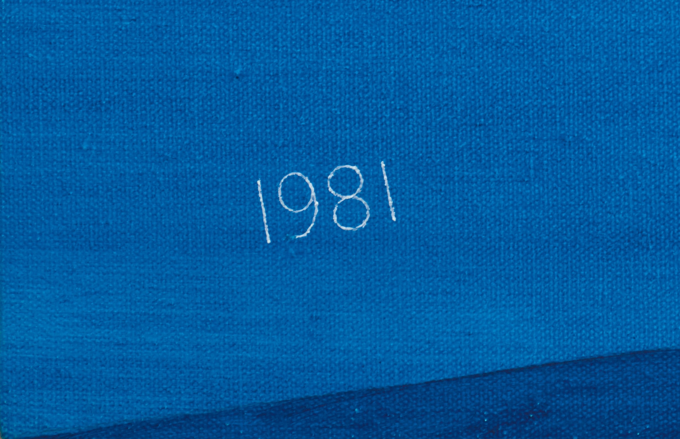
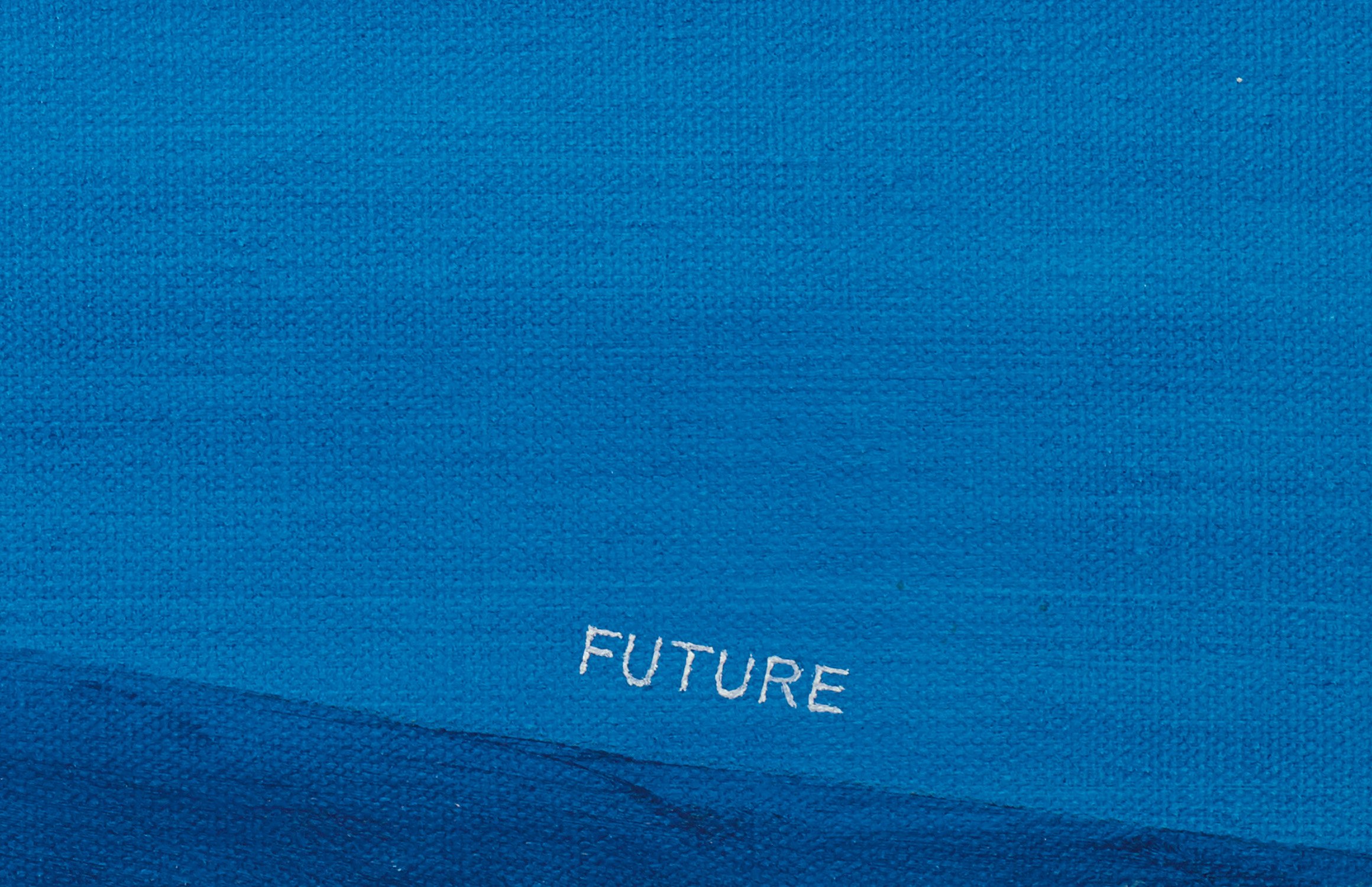
Silhouetting the earth’s arch against an elongated azure expanse, with the numbers 1981 and the word ‘Future’ floating at either end of the planet’s disappearing corners, 1981 - Future is a captivating example of Ed Ruscha’s highly graphic oeuvre. Though the writing of the title’s denominators appears faint – thinly delineated in white paint against the composition’s dominant blue hue – it is instantly recognisable as Ruscha’s. The text applied in his emblematic font is, as the artist explains, ‘one of my own inventions, which I call 'Boy Scout Utility Modern'. […] There are no curves to the letters – they’re all straight lines – and I’ve been using it for years’.i Devised in minuscule size, the eponymous date and word – 1981 and ‘Future’ – require active participation from the viewer, who must get close to the composition to decipher its constitutive elements. Yet, Ruscha elucidates that his linguistic additions avoid symbolism, in the case of 1981 – Future detaching the two words from the panoramic ground’s inherent meaning. ‘Sometimes found words are the most pure because they have nothing to do with you’, he explained. ‘I take things as I find them. A lot of these things come from the noise of everyday life’.ii
Ruscha’s Cinematic Stillness
'I’ve been influenced by the movies, particularly the panoramic-ness of the wide screen. The wide screen says something about my work.' —Ed Ruscha
Having worked as a type-setter and a sign painter in the 1950s, Ruscha frequently harnesses his experience and dexterity in graphic design to convey polished and visually impactful compositions. Notably, he utilises warped dimensions to appeal to the viewer’s familiarity with commercial aesthetics. ‘I think I centred on words because they have no size’, the artist explained. ‘So if I painted the word 'boss', I could paint it that big, or I could paint it that big’.iii In the present work, the earth’s curving shape dominates the canvas’ width, whilst the eponymous date and word are laid out to its extremities in minuscule scope. In this way, the audience is strategically plunged in Ruscha’s deep blue panorama, halted from deciphering the fragmented title in the lower section of the composition – as perhaps they would be in a similarly designed advertising poster, or on a cinema screen diminishing the size of written information in favour of visual counterparts. In its engulfing construction, 1981 - Future perfectly embodies Sterling Ruby’s claim that ‘For me, [Ed Ruscha’s] work represents the perfect balance of the apocalypse and serenity. It’s almost like it’s symbolizing some sort of dichotic meditation on existence’.iv At once deafeningly mute and peacefully composed, 1981 - Future indeed conjures the precarious paradox that dawns on the ambivalent notions of stillness and silence.
Evincing subtle movement in the planet’s slow arch, 1981 - Future furthermore conjures Ruscha’s prowess in rendering the earth’s natural manifestation of stillness, here depicted on a macro-level. Similarly attending to these natural phenomena subsequently turned into poetic and compelling tableaux, the artists Vija Celmins and Hiroshi Sugimoto have been known to represent, most typically, a night sky studded with stars or the meanderings of the sea. The difficulty in emulating these scenes lies not just in their intent of verisimilitude; it is furthermore the ongoing play between the big and the small, the wider picture and its microscopic detail, that renders the exercise reproducing earthly things – which entail the suggestion of environmental sounds, or in the case 1981 - Future, total and utter silence – an extremely challenging one. For this reason, Ruscha has often been praised for his precise draftsmanship – a skill that not only allowed him to convey sublime images, but also to create a typography of his own.
i Ed Ruscha, quoted in Kristine McKenna, ‘Ed Ruscha in Conversation with Kristine McKenna’, Ed Ruscha: Fifty Years of Painting, exh. cat., Hayward Gallery, London, 2009, p. 58. ii Ed Ruscha, ed., They Called Her Styrene, London, 2000. iii Ed Ruscha, ‘The Tension of Words and Images’, TateShots, 23 May 2013, online. iv Sterling Ruby, ‘Ed Ruscha’, Interview Magazine, 20 August 2016, online.
Provenance
Ace Gallery, Los Angeles The Christopher Samish Foundation Sotheby's, New York, 12 November 2009, lot 266 Acquired at the above sale by the present owner
Exhibited
Los Angeles, ARCO Center for Visual Art, Ed Ruscha: New Works, 6 January - 14 February 1981, n.p. Vancouver, Ace Gallery, Edward Ruscha: Recent Paintings, June - July 1981
Literature
Kay Larson, 'Art', Village Voice, 1980, n.p. Peter Schjeldahl, 'Edward Ruscha', Arts + Architecture, vol. 1, no. 3, August 1982, p. 25 (illustrated) Robert Dean and Erin Wright, eds., Edward Ruscha: Catalogue Raisonné of the Paintings, Volume Two: 1971 1982, New York, 2005, no. P1980.26, p. 348 (illustrated, p. 349)
Quintessentially American, Ed Ruscha is an L.A.-based artist whose art, like California itself, is both geographically rooted and a metaphor for an American state of mind. Ruscha is a deft creator of photography, film, painting, drawing, prints and artist books, whose works are simultaneously unexpected and familiar, both ironic and sincere.
His most iconic works are at turns poetic and deadpan, epigrammatic text with nods to advertising copy, juxtaposed with imagery that is either cinematic and sublime or seemingly wry documentary. Whether the subject is his iconic Standard Gas Station or the Hollywood Sign, a parking lot or highway, his works are a distillation of American idealism, echoing the expansive Western landscape and optimism unique to postwar America.